The ATM at the bottom of the world
The ATM at the bottom of the world
Wells Fargo has an ATM (well, two) in Antarctica. Pretty fascinating read. [via waferbaby]
The ATM at the bottom of the world
Wells Fargo has an ATM (well, two) in Antarctica. Pretty fascinating read. [via waferbaby]
Khoi’s leaving the New York Times
Not saying what’s next, I’m certain it’ll be great

What was your very first iTunes purchase?
Log in to your account in iTunes, then click “Purchase History” and jump to the earliest possible date.
Apparently, at one point in my life, I liked the Ataris’ cover of “The Boys of Summer.”
I’m sorry.
My original iTunes account is long gone but I remember my first iTunes purchase because I angsted over it for days, I kid you not. I was worried about the DRM, worried about all of the Slashdot comment threads about how this meant the end of freedom and ownership forever. Seriously, I actually debated it.
Then I came home to my crummy, messy one bedroom after a night of barhopping across Wrigleyville, buzzed and happy with the world, hit BUY on Wilco’s “Yankee Hotel Foxtrot” and marveled that this was the fucking future, man.
Hey, cool, Tumblr did a smart thing and hired the smart guy behind the Newsweek tumblr. Smart!
After spending the last year showing us the unique role Tumblr can play in connecting journalists and readers, we are so proud to have Mark joining our team. He is truly one of the clearest and most creative thinkers around Tumblr. I don’t think we can sum up our excitement better than he has
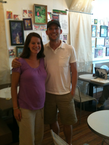
I met @jimray and it wasn’t nearly as awkward as this picture suggests.
I’ve been a ccsteff fan for a while, doubly so now.
The awkwardness is mostly coming from the dude at the next table who I’m pretty sure thought this was a first date.
SimpleBits: Welcome to the bitstream
Hot diggity that’s a fine lookin Tumblr, welcome, Mr. Cederholm!
@phillygirl discovered the secret to John’s success
I couldn’t sleep last night so I made the world’s easiest Safari extension to auto-apply text-rendering: optimizeLegibility to every page you come across (John Gruber pointed this out yesterday).
All it does is inject a body{ text-rendering: optimizeLegibility } style into every page you hit. I’ve heard rumors of performance issues but it should be fine on most modern computers.
The name is a nod to a clever joke David Friedman made a while ago. My pal Neven helped me with the icon.
Over at msnbc.com, where I spend most of my waking hours, we1 just launched a massive redesign of our story pages. For a news site, the story page is the most atomic and probably most important page of the site. The homepage (“cover” in our vernacular) and section fronts get a lot of attention and push our readers but the story page is where they’re trying to go and it’s where they spend the most time when they get there. This was a massive undertaking, the seeds of which were planted almost two years ago, and spanned the entire company, it’s amazing to finally see it live.

Besides all of the new typography, navigation, color and multimedia, the real story is the fundamental rethink of what a story page should be. For too long, the formula of online news has been a spine of text that media elements hang off of like a sad Charlie Brown Christmas tree, competing with ads and widgets for attention. What these new pages do is suggest that a story is more than a jumble of these parts, in fact, it works best when every element ties together cohesively.
This was the first fundamental rethink, the suggestion that text doesn’t always have to carry the story. Sometimes a video tells the story best, sometimes a slideshow, or an interactive map. Sometimes a story has no text at all. It’s why the headline seems to float above the text, for instance, and why sometimes the top element on the page is a video.
The next fundamental rethink is the pageview, something my pal Mike Davidson wrote a very smart post about. The pageview metric has been a fools game for far too long, a hollow mechanism to try to make impressions quantifiable, which were foisted on the web at a time when nobody knew how else to take credit for eyeballs. They’ve never really worked, at least not how the ad brokers of the late 90’s promised, and it’s time they finally died. In place of the pageview comes engagement, which should actually reward design that considers the user instead of simply trying to shuffle her off to the next ad impression.
Along with the dying pageview goes its inglorious twin, the banner ad. The fates of both of these are intwined because the CPM on banner ads, the proverbial bread and butter of internet advertising, is now so low that you have to display a metric shit ton of them to generate any real revenue. Why show one page with one banner ad when you can run the same article across three pages and make a hundredth of a cent more? Good riddance.
Which isn’t to say that display advertising is coming to an end. There are still plenty of ads, many of them run of site supplemented by text links. Another of the big rethinks, though, is that there can be only one way to run an ad across all of the story pages, predefined IAB blocks in well established ad-holes, text snaking between them. In fact, the team designed and built a number of different ad scenarios – dozens, in all – to account for a whole host of sponsorship scenarios. The end result is, hopefully, ads that are more effective, less annoying and built to look like they belong on the page, instead of just slapped in place.
There is a lot going on on these pages, not just visually but as you interact with it. Ads follow you down the page, content fills in as you scroll down, the scroll bar has annotations highlighting more content. These new pages aren’t just dynamic, they are a full blown, client side application. They use cutting edge CSS and markup, microformats, sophisticated javascript frameworks, personalization, social networking.
The end result is a story page that acts less like a page and more like an application, less newspaper, more gmail. This adds a lot of complexity to the page and will no doubt need some work but it also allows for a great deal of flexibility, new sponsorship models, new story telling opportunities, new levels of reader interactivity. Most importantly, the page is aware of itself – inline tease elements can gracefully scroll down the page, ads can wait until the content is loaded, new content can load in place, asynchronously.
By new media standards, msnbc.com is something of an old timer – the site launched in 1996, has survived booms and busts, births and deaths, trends and reorgs. The system that powers one of the biggest online destinations in the world has evolved, mostly to keep up with the ever growing traffic and regularly serves up over a billion page views a month without breaking a sweat.
While there’s been plenty of focus on keeping the site stable, this redesign was an opportunity to reevaluate how stories were actually published. The team rebuilt the backend using a custom MVC framework that is inordinately more flexible and accessible to more designers and developers. It’s the kind of unsung, backend work that usually goes unrecognized when there are so many new things to look at but without it, none of this would’ve been possible. Even more impressive, all of this was happening while the design and front-end development were being done in parallel. Essentially two huge, bet-the-company projects were happening at the same time, each relying on the other to succeed.
My colleague and pal Craig Saila did a fantastic job of shepherding a lot of the day to day development of the new pages, he’s got more details on the front and backend development work.
I’ve been staring at these pages for a while, these are the parts I like most
The basic text layout is finally clear, legible and, to my eyes, a joy to read. Good riddance, Arial.
See those icons next to the scrollbar? They highlight other media on the page and correspond to how far down the page you have to scroll to get there (you’ve probably seen something similar on Google Chrome, we still think it’s clever)
The left navigation, with its late-90’s era flyout menus, is finally gone, replaced with what our creative director dubbed “the upscroll”. The sitewide navigation is actually across the screen, with teases to more content hidden higher up, which helps to put the story content in front of you sooner and hopefully give a richer glance at the news across the site. It’s subtle and not necessarily obvious but I think once people discover it, they’re going to love it.
I really love the look of the embedded video player, the handiwork of design superstar Shezad Morani. Even works on your iPad!
The new drawer metaphor for exposing more content. In the old days, everyone tried horizontal back and forth (think the next button on every slideshow you’ve ever seen) now it’s all about using dynamic vertical space. We’re betting that by now, people understand how to scroll up and down. I’m still undecided about the “show more text” tab, though.
Personally, I don’t love the toolbar affixed to the bottom of the viewport. I do like that I can turn it off.
I love the page footer. Instead of a droll, templatized list of links, this is dynamic, relevant and related to the story you just read or watched. It’s a big, bold footer that will drive more readers to more content that they care about.
By now, I’ve been through several redesigns, not just at msnbc, and every time it happens, we get letters that go something like this: I’ve been a loyal reader for x many years, you changed something/removed something/made everything worse, I’m going to CNN/Yahoo/the New York Times unless you fix it immediately or offer me a “classic view”. Frankly, I’m of the opinion that this sort of entitlement leads to a tyranny of users and poor design. There’s no doubt that big, ambitious design changes will require more work, some rethinking and recalibrating based on real user data, but that’s why they’re bold. Otherwise, you just end up copying the same hashed out blog designs 2 everyone’s been stuck with for a decade now.
I’ve long lamented the fact that those who blog rarely do 3 and in this case, there aren’t nearly enough people tooting their own horns about the work they’ve done. This was a massive undertaking that spanned the company over the course of nearly two years, from design to editorial to development to sales to marketing. My own role was small but it was an honor to work with such a talented group.
I always hate using the royal we when talking about these types of projects, especially when my own role was really pretty small. Unfortunately, our creative director, Ashley Wells, doesn’t blog much, probably because he’s too busy working on the next big thing, and the true workhorses behind this sweeping project are hopefully catching up on their sleep. I’m proud to say that I get to say I work with the people who did the heavy lifting here and I hope I do them justice. ↩︎
My buddy Ben and I have a shorthand for this – neverchangenews.com (I actually own that domain, just in case). NeverChangeNews is the most boring news website in the world, with one important feature – the design will never change. We figure if all of these users who keep threatening to leave after every “awful” design changes ever make good on their promise, eventually everyone on the internet will end up using NeverChangeNews. ↩︎
present company excluded, of course. ↩︎

Cheerwine-infused Krispy Kremes to hit stores - CharlotteObserver.com
The doughnuts will be packed with Cheerwine-infused crème and topped with a chocolate icing and a healthy dose of red and white sprinkles, said Tom Barbitta, vice president of marketing for Cheerwine…
The doughnuts will be released exclusively in the Carolinas.
(via pretty much everyone on Facebook in North Carolina)
As luck would have it, I’ll be in North Carolina next week.