I admire the business Zuckerberg’s built; but I don’t trust him.
I admire the business Zuckerberg’s built; but I don’t trust him.
—Wired UK’s David Rowan neatly sums up what is probably the best reason to avoid Facebook.
I admire the business Zuckerberg’s built; but I don’t trust him.
—Wired UK’s David Rowan neatly sums up what is probably the best reason to avoid Facebook.
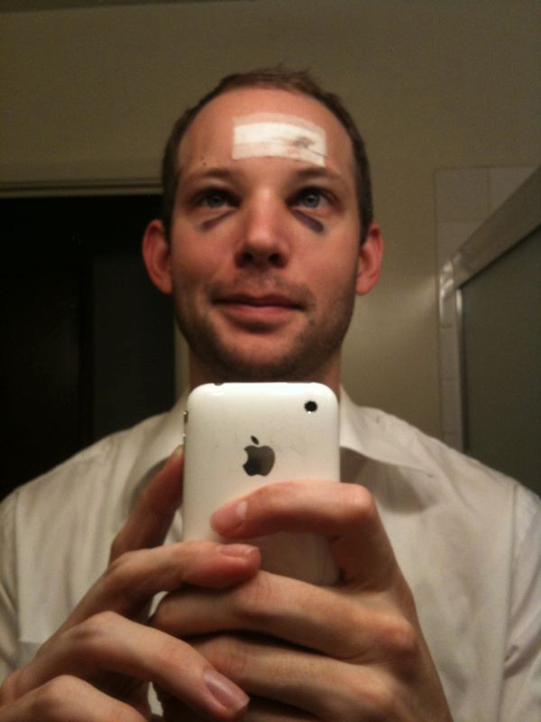
Post bumpectomy, day 3.
why even make a browser if youre not going to include an option in the right click menu that appears in all the other browsers? like firefox, opera, IE so many people use this. I have to keep switching back and forth from chrome and firefox when i want to apply a pic as my wallpaper….its a fcukn hassle…
—Man, people sure do get uptight about their browsers. This bug thread to add a “set image as wallpaper” feature to Chrome has nearly 500 comments. About a feature that has absolutely nothing to do with, you know, browsing the web.

Had a lipoma excised from my head today. You should see the other guy!
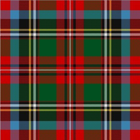
Did you know North Carolina has its very own tartan? (For Jelisa, whom I’ve still yet to see since you slack bastards can’t be bothered to fire up your torrents!)
Samsung and AVEDA, a US based cosmetic company, propose in Taiwan, the Galaxy S Femme, a complete kit that not only includes a Pink Galaxy S, but also a complete AVEDA traveling kit including several creams and cosmetics from the manufacturer, a travel kit voucher as well as a 4GB microSD card that included an AVEDA made software in order to help and advise women on which treatment their need to keep both their skin and hair young and beautiful.
—Samsung’s phone for girls packs its own makeup kit. I think the default ringtone is “Math class is tough!”

I love this! Timur Civan screwed a 102-year-old Russian 35mm cinema lens onto his digital SLR. The results are beautiful, the modern world seen, quite literally, through a century-old lens.
The act of creating deliberately confusing jargon and user-interfaces which trick your users into sharing more info about themselves than they really want to.
—Privacy Zuckering, a great definition from DarkPatterns, a site dedicated to the art of deliberately evil design decisions.
Elizabeth Warren will head the new Consumer Financial Protection Bureau
This is fantastic news. Warren is the reason the new consumer protection agency exists in the first place, she’s the obvious choice to lead it.
My only complaint is that the Obama administration isn’t picking a fight via an outright confirmation hearing. I suspect, given the way things are going right now, no one has the stomach for it leading up to the election but that strikes me as dumb. Force the Republicans to side with the banks that prefer sleazy lending practices, force them to articulate why we shouldn’t be protecting the economic well-being of the other 95%, force them to side with the very institutions that got us into this mess.
Of course, Republicans are masters of convincing their base to vote against their own economic self-interest with sloganeering and outright deception. I’m sure Sarah Palin is already spinning up some death-panel style argument against protecting people from being defrauded.
At the risk of sounding like a social media douchebag, here are some quick thoughts about the new twitter. I was lucky enough to get in on the launch1, so I’ve been using it for about a day now (not just watching demos).
A much needed redesign that incorporates all of the changes Twitter has seen over the past 4 years with a nod to future plans, like User Streams and Annotations. It has a post-web feel, bringing lots of new ideas from smartphone and iPad interfaces. It’s quite well done, Doug Bowman and his crew should be proud of their work (and that they work at a place that values design, not algorithmically selected shades of blue).
Hovercards appear to be dead, replaced with the right hand sidecar. Good riddance. (Sorry, Chloe)
This is the most “app” feeling site since Gmail (including Facebook). The notion of a page seems to be dead, both technically (everything is hashed off the main url and built client-side) and philosophically. I imagine that in the long run, there are going to be some impressive gains, since everything appears to be chunked into much more manageable pieces, rather than requiring a full page load, another idea borrowed from mobile development. The new site is incredibly responsive, congrats to Ryan Sarver and the rest of the platform team.
Of course, it’s still a web app, so the limitations of the browser are still there. I found myself getting a few levels deep in the right hand sidecar, then clicking back in the browser, only to be completely lost. This is, of course, not a problem unique to Twitter (who hasn’t closed a tab with a cmd+w when they meant to close a javascripted lightbox?) and highlights a need for some new approaches to browsers and web apps.
I was initially worried it would too closely ape the Twitter for iPad client, which I find gets too cluttered almost immediately. The new site is certainly active, but never feels as cluttered.
That said in some parts, it feels like they don’t quite know what to do with the inherent brevity of Twitter, so they stack a bunch of small bits on top of each other. The right sidecar when you click a tweet would look weird with just a block of whitespace so you get other recent tweets from that user but this too feels out of place. It gets worse when you click into a conversation, which includes the original tweet(s) (good!) as well as a bunch of extra metadata that tends to add more noise than signal (not so good!). Recent Favorites, Trends and Who to Follow suggestions amp this up considerably, especially with no way to mute them.
Much of the buzz seems to be about embedded media elements, which are handy and useful, and seem sort of natural with the rest of the redesign. They’re clearly trying to do the right thing and strike the proper balance between creating a natural, engaging experience for Twitter users without stealing content from third party sites. If this means I never have to see another yfrog picture buried under Justin Bieber ads, I’ll call it a win.
The keyboard shortcuts seem nifty and well chosen. I just wish I could remember to use them inside a browser, that’s never really felt natural to me 2.
There’s an obvious push to keep you on the page, which might be a nod towards how they’re going to make money, though it seems like a small one given how much of their traffic comes via the API.
More than anything, the site really seems to underscore that Twitter is a platform, not a site. That’s certainly been their M.O. for years now but it finally feels that way. That strikes me as an important shift for their users to understand, too, as Twitter hopes to keep expanding.
I haven’t seriously used the Twitter web site in years, preferring a variety of device and desktop clients instead. There’s not much in the redesign that’s going to draw me away from an app, but that’s ok. If anything, the new site acknowledges that.
my day job involves occasionally working on partnerships with some fantastic folks at Twitter, which is really how I got the early hook up. Thanks, Isaac! ↩︎
this despite an avid devotion to vi ↩︎