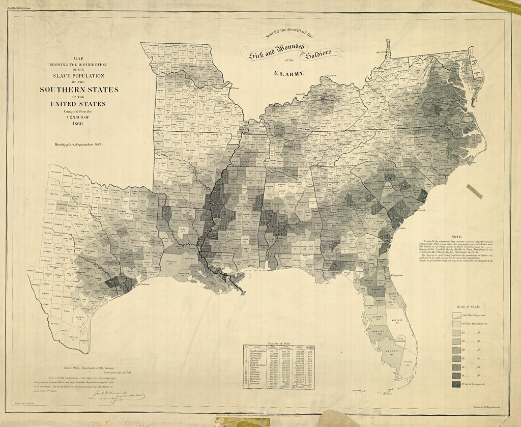
this is pretty amazing a choropleth map from
Posted on .

This is pretty amazing – a choropleth map from 1861 showing the distribution of slavery across the American south. It’s certainly arresting in what it shows but also wouldn’t be at all out of place alongside a modern map visualization. Kudos to the Times for digging this one up and adding some historical context.